Agree to disagree:
The uncertainty, the ambiguity, and the clustering algorithm
Rui Qiu
Updated on 2021-10-11.
Welcome back to the chapter on learning, practicing, and finding the limitation of the clustering algorithm. For now, the whole portfolio seems to be deviating from the original dozen questions raised. Nevertheless, the overall goal is to showcase the capability as a data scientist, isn’t it?
Back to the topic, the focus for this part of the portfolio is to apply various clustering algorithms with multiple sets of metrics, methods, and parameters to approximate the similarity among items. The items here are (1) NBA players active in the last regular season (2020-2021); (2) News titles and headlines from four websites within the time frame of a month.
Since the initially collected data won’t fit in well here, new waves of data are assembled in order to accomplish these tasks. The details will be mentioned below.
- GitHub repo: box2box
- R script for clustering and predictions: clustering.R
- Python script for clustering: clustering.ipynb
- R script for topic modeling: topic-modeling.R
1. Clustering NBA players by their stats
The data comes directly from Basketball Reference. This is because the previously cleaned record data from the last chapter consist of lots of non-numeric data. Specifically, the categorical data are used to describe the shot attempt scenario.
So for the data used this time, these are elementary but thorough statistics appearing in any box score of a basketball game. They are nothing “advanced” like points per 36 minutes, etc. However, it’s undeniable that these numeric values describe the playing style of a player. (Honestly, stats don’t lie, but they don’t tell the whole story.) In this way, hopefully, they can tell the playing position in the game.
1.1 Data cleaning
You can access the raw data set with the link below:
The preliminary cleaning contains three major tasks:
- Keep the total statistics if a player got transferred from Team A to Team B within the season.
- Clean the player’s name.
- Ideally, the label will be the player’s position, so we remove some variables having nothing to with the position, such as rank, team, and position (itself).
- Drop players with missing data. (Very few players with limited playing minutes have this trait.)
The variables before cleaning:
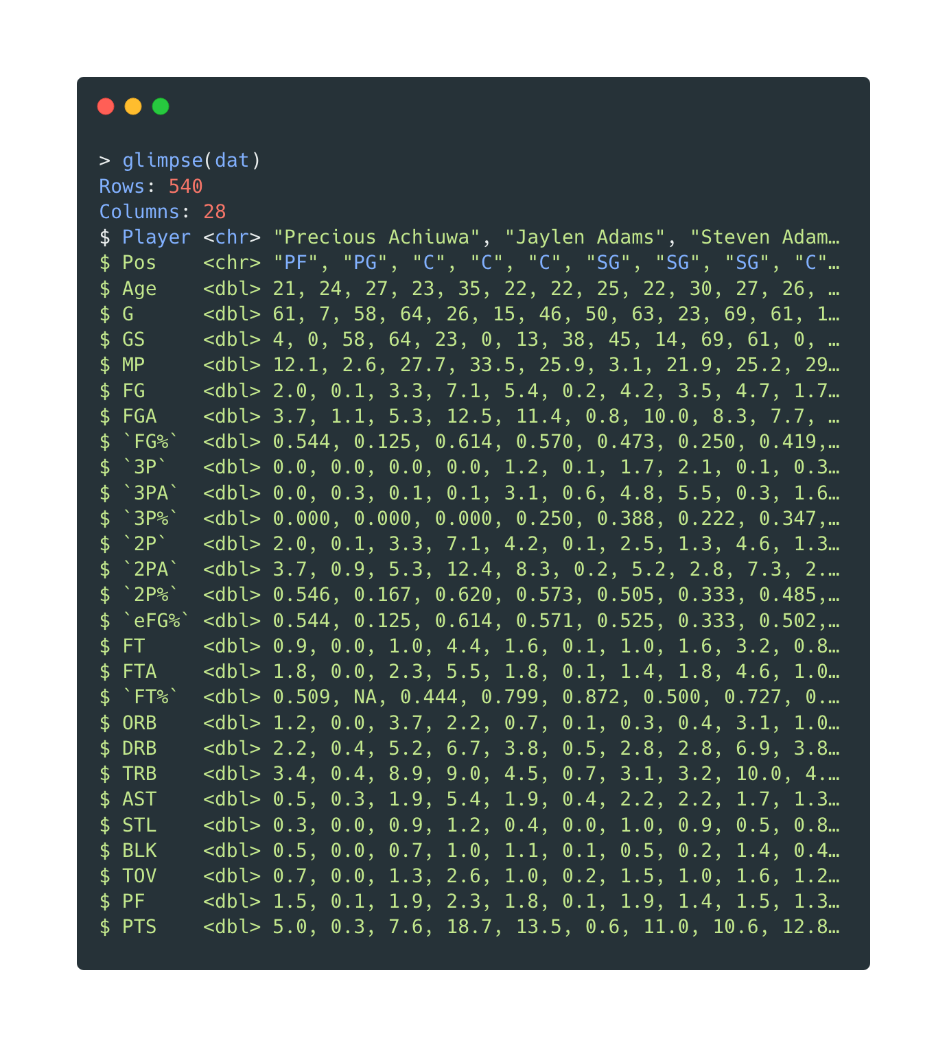
Open in new tab to see in full size.
The variables after cleaning:
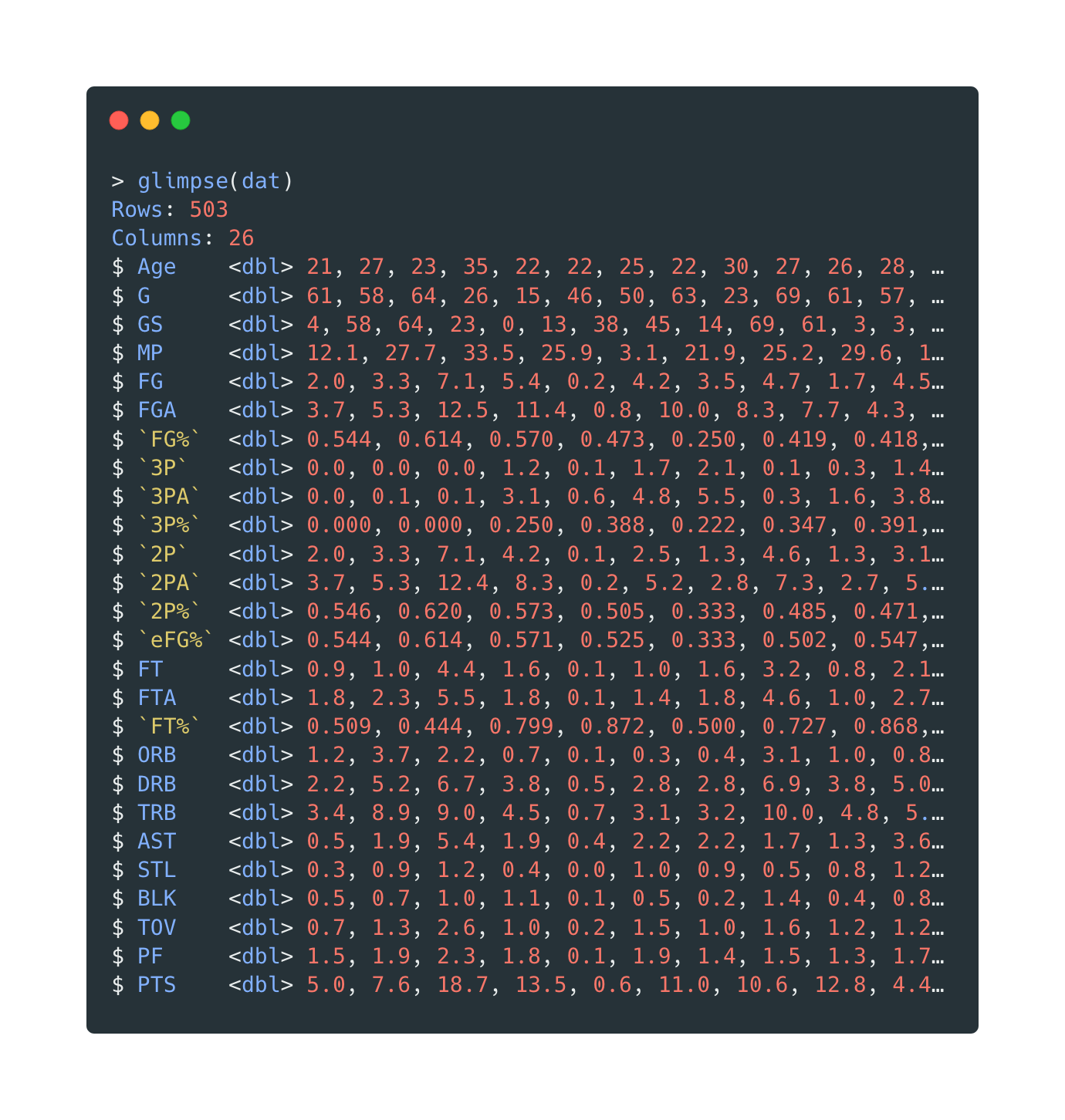
Open in new tab to see in full size.
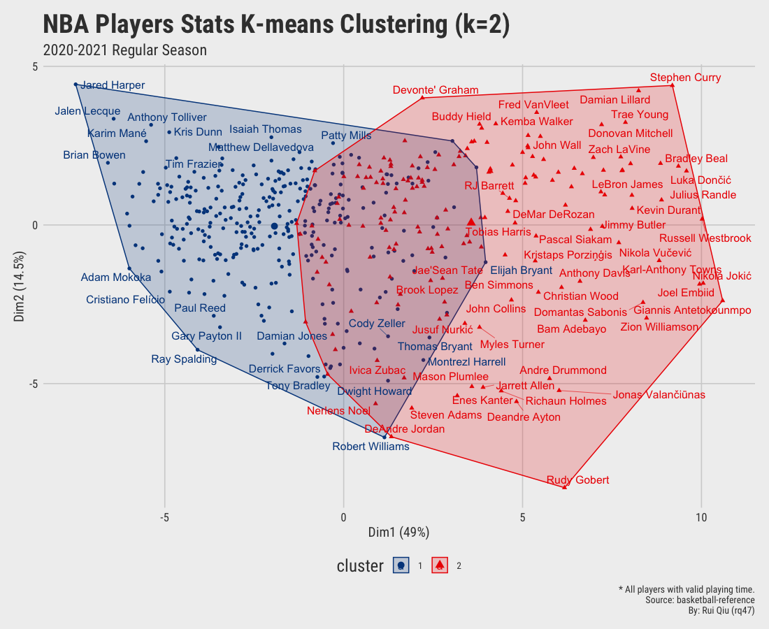
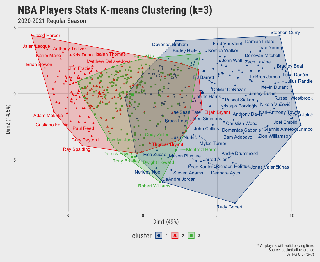
1.2 K-means clustering with different $\ k$ values
A re-usable function iter_kmeans() is defined to take in the data, the
value of $\ k$, a string “flag” remark, and the detailed caption, and outputs the
clustering visualization.
Open in new tab to see in full size.
Open in new tab to see in full size.
Open in new tab to see in full size.
Open in new tab to see in full size.
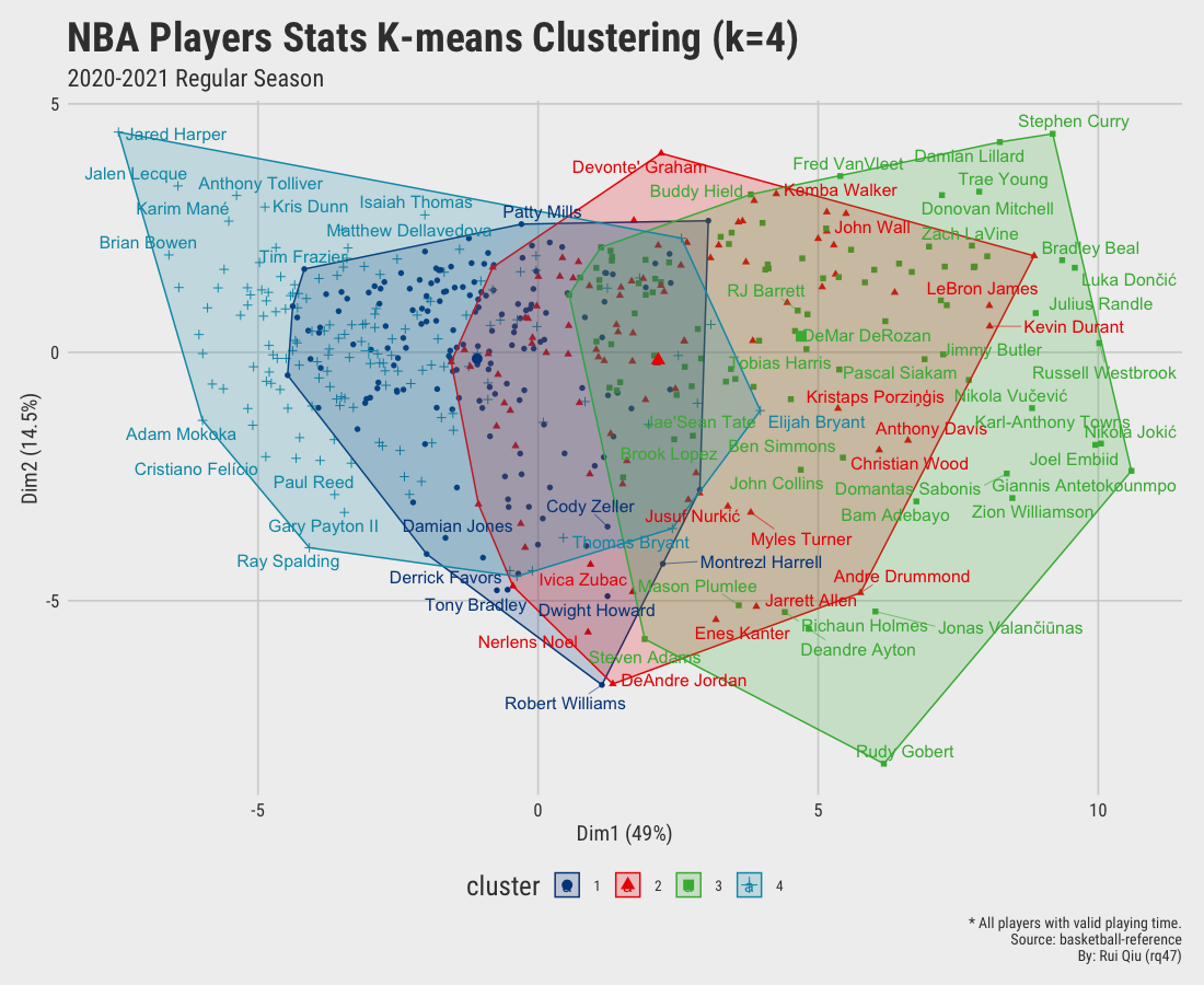
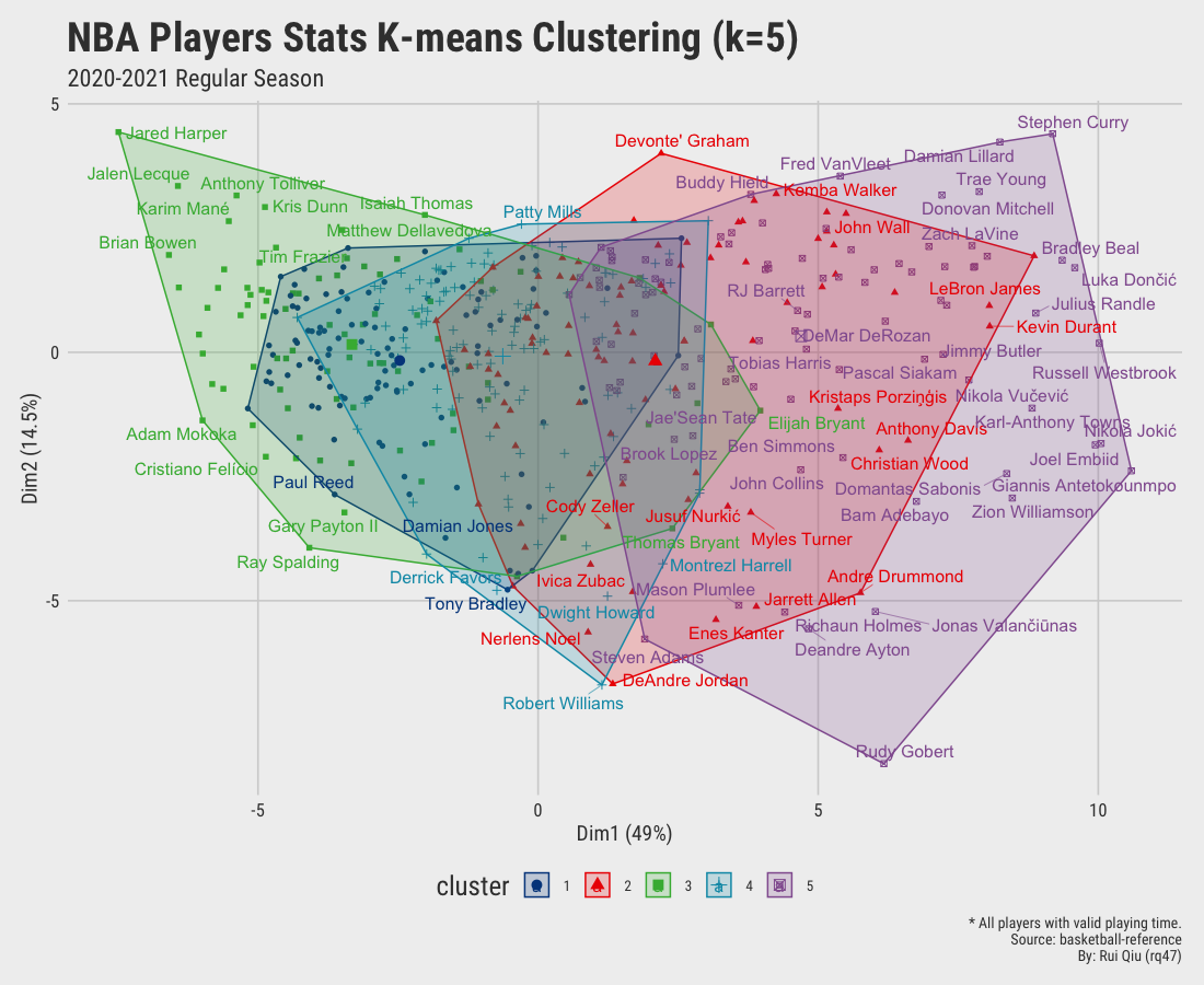
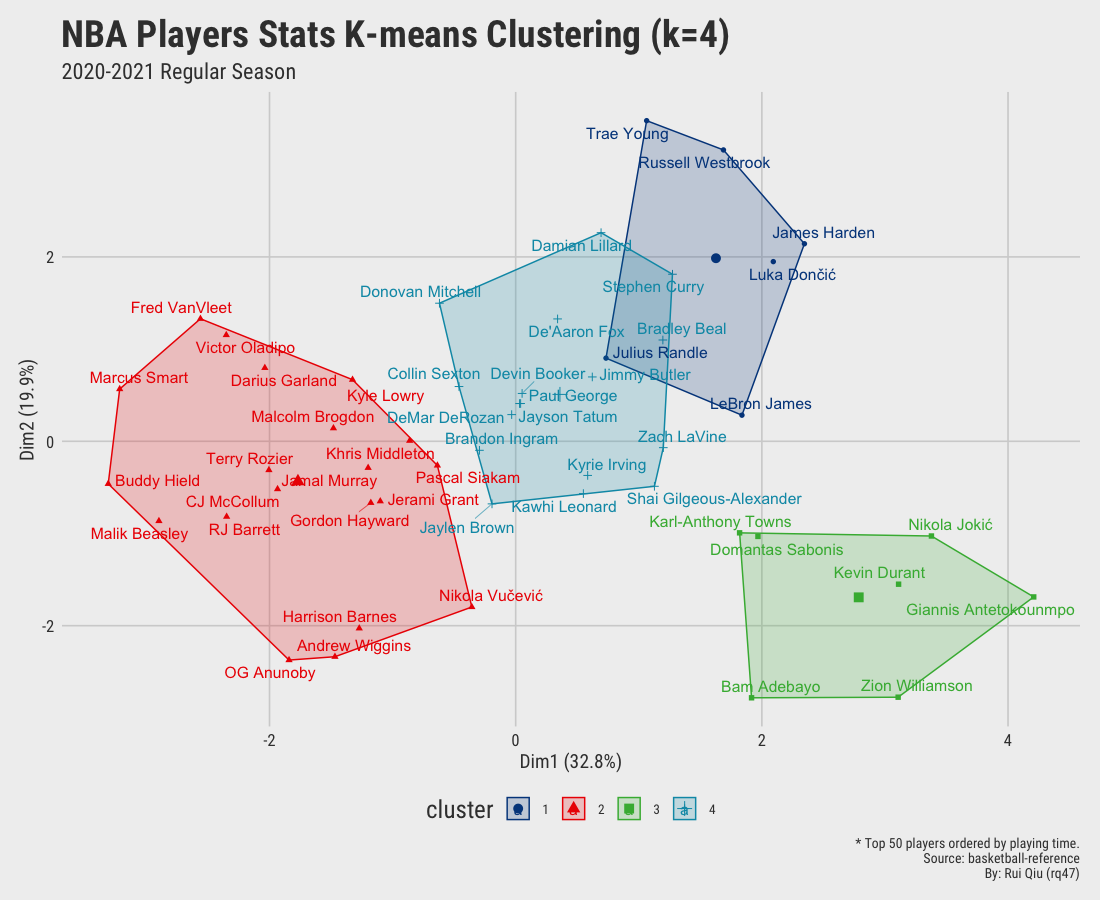
Since we aim to cluster the data by their playing position, the clustering results shown above are more or less dominated by playing time. It’s pretty apparent players clustered on the right-hand side of the plot are generally starters. In contrast, the ones on the left are benchwarmers mostly. It is not hard to understand that players who have fewer opportunities have a high tendency to be short in stats. Moreover, the clusters generated are not satisfying, to be honest. Too much overlapping.
A proper fix to this is to restrict the selection of players to the ones with sufficient playing time. At the same time, further slice the involved variables to highlight the de facto playing style of a player. In other words, it’s compulsory to get rid of those variables not contributing enough to that. For instance:
- Keep total rebounds, remove offensive rebounds, and defensive rebounds.
- Remove stats like playing minutes, games played, games started, etc.
- The data is standardized so that variables become comparable. (This is also a hard requirement for hierarchical clustering.)
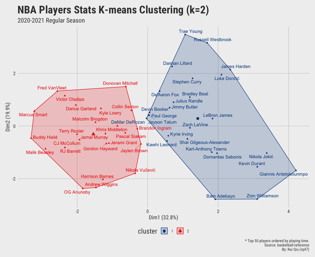
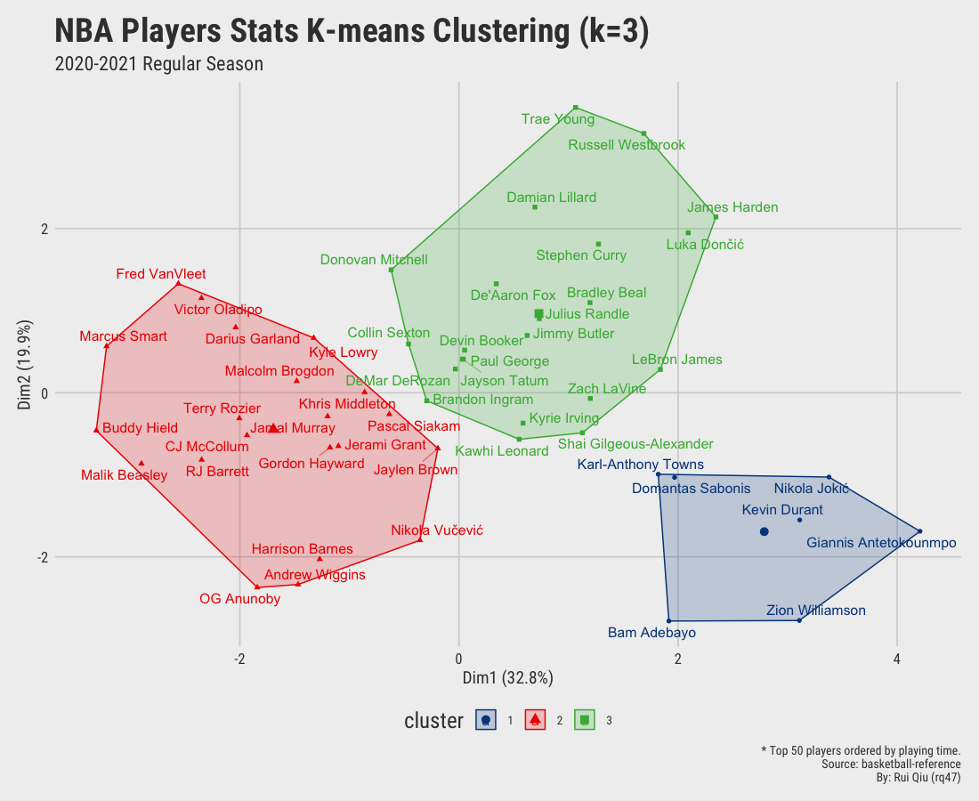
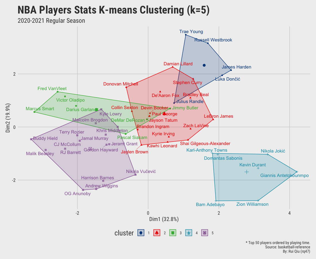
In this way, a list of 50 players ranked by their playing minutes in the last season is kept. For the stats remained, they are:
FG%: field goal percentage.3PA: 3-pointers attempts.eFG%: effective field goal percentage.FT: free throw attempts.TRB: total rebounds.AST: assists.STL: steals.BLK: blocks.TOV: turnovers.PTS: points.
Keep in mind that this selection of variables might be as flawed as the previous “all-inclusive” strategy. Nevertheless, at least it should highlight some playing styles.
If you run the iter_kmeans() function again with the modifications, you
probably would get similar results below.
Open in new tab to see in full size.
Open in new tab to see in full size.
Open in new tab to see in full size.
Open in new tab to see in full size.
Significant improvement can be concluded as the clustering by small value $k$ seems gratifying. Still, the overlapping issue remains as $\ k$ increases to 4 and up.
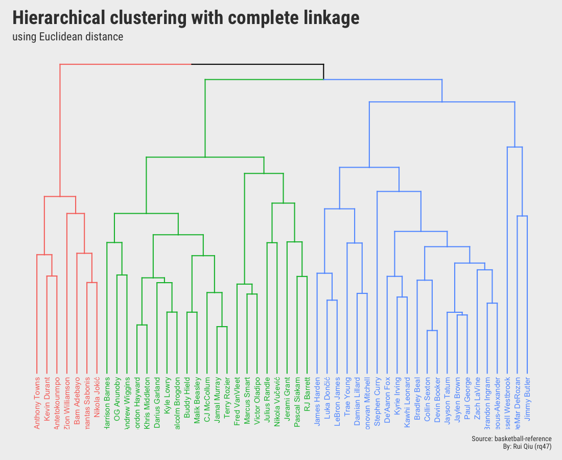
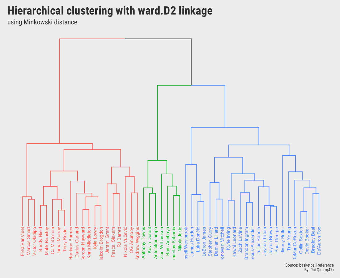
1.3 Hierarchical clustering
Hierarchical clustering is an alternative way to k-means used above to detect similarities and group the records in datasets. One of the most attempting traits of hierarchical clustering is no requirement for a pre-determined $\ k$ value.
To be fair, this section is only touching the very surface of hierarchical clustering. It is not designed to dive deep into the topic. The post Hierarchical Cluster Analysis by the University of Cincinnati is a great reading on R package selection, the algorithm itself, and understanding the dendrograms.
For this part of the task, two types of hierarchical clustering are performed and ultimately compared.
Both hierarchical clusterings are agglomerative (bottom-up):
- Euclidean distance to measure dissimilarity, Complete Linkage as the agglomeration method.
- Minkowski distance to measure dissimilarity, Ward’s D2 Linkage as the agglomeration method.
Open in new tab to see in full size.
Open in new tab to see in full size.
Although the two dendrograms seem to be different and are not identical, they still share a lot in common. Please ignore the color mapping in these two, and it’s not hard to detect that some players are always grouped with other certain players. And the most important takeaway from these two is that they both pick $\ k=3$.
To further compare the dendrograms, a tanglegram is drawn to show the big picture in comparison:
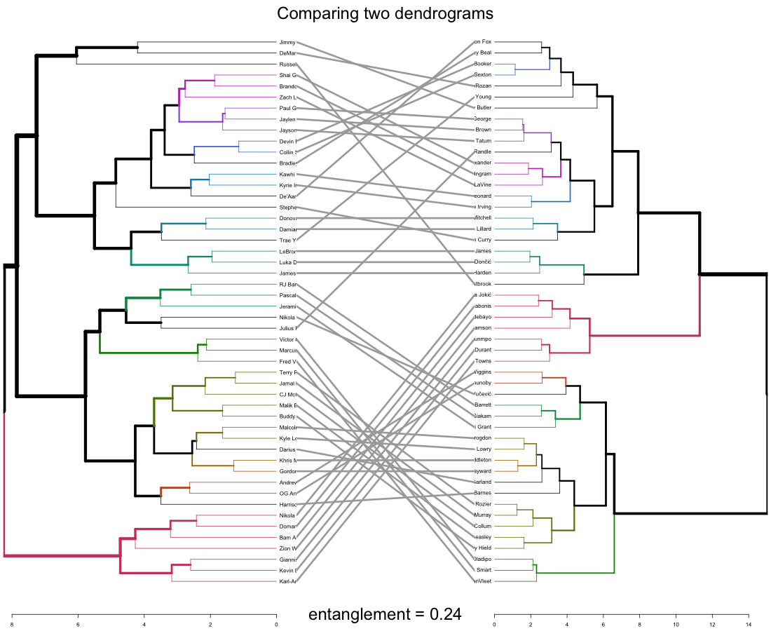
Open in new tab to see in full size.
The entanglement shows the quality of the alignment of the two trees (dendrograms). 0.24 is a rather low entanglement coefficient which corresponds to a good alignment.
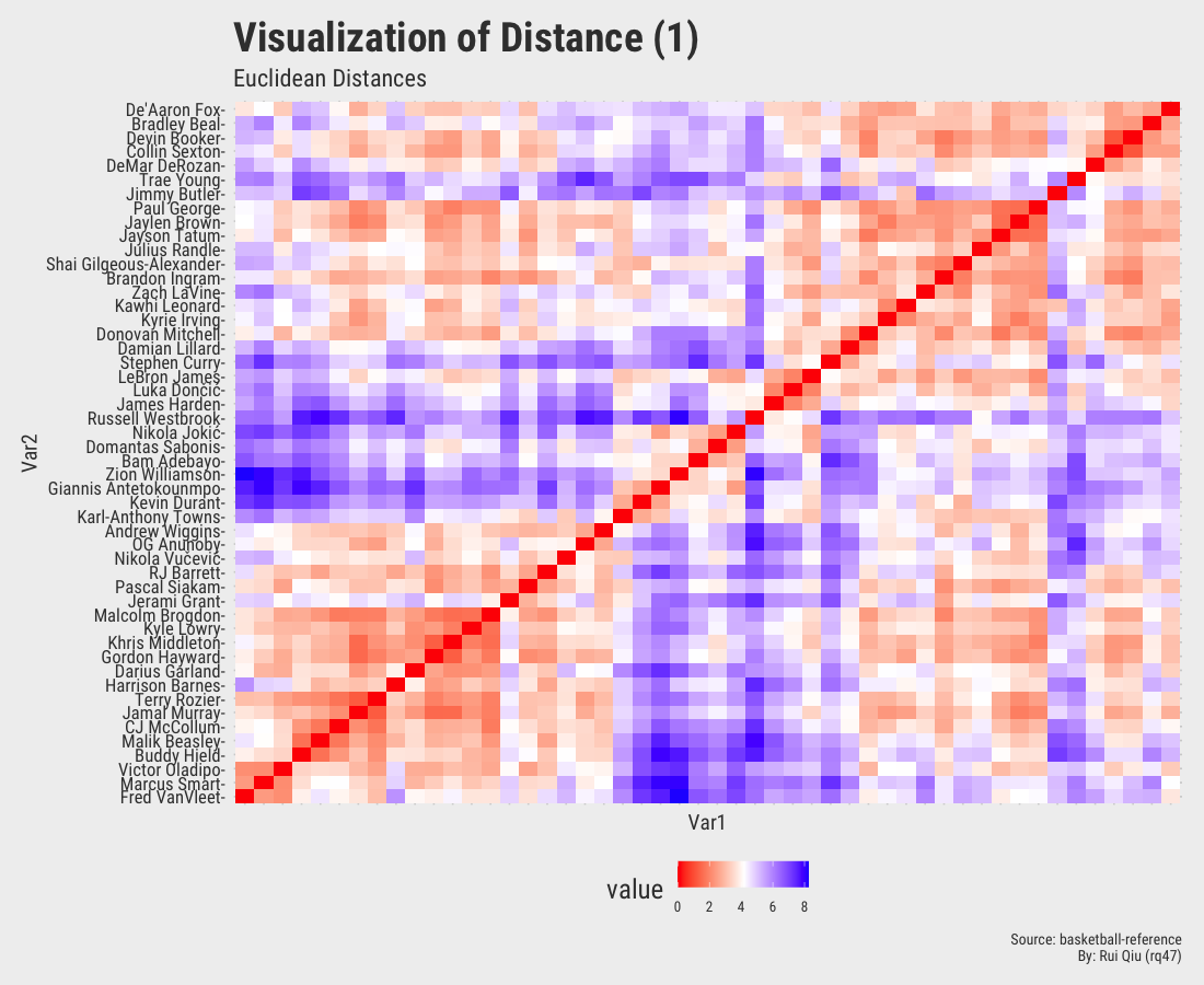
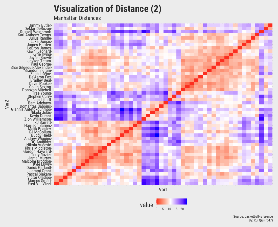
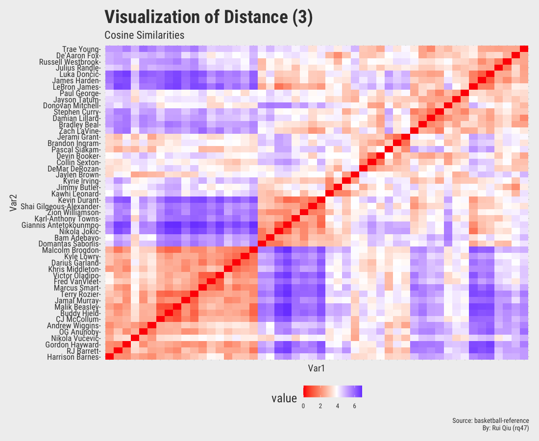
1.4 Distance matrices with various metrics
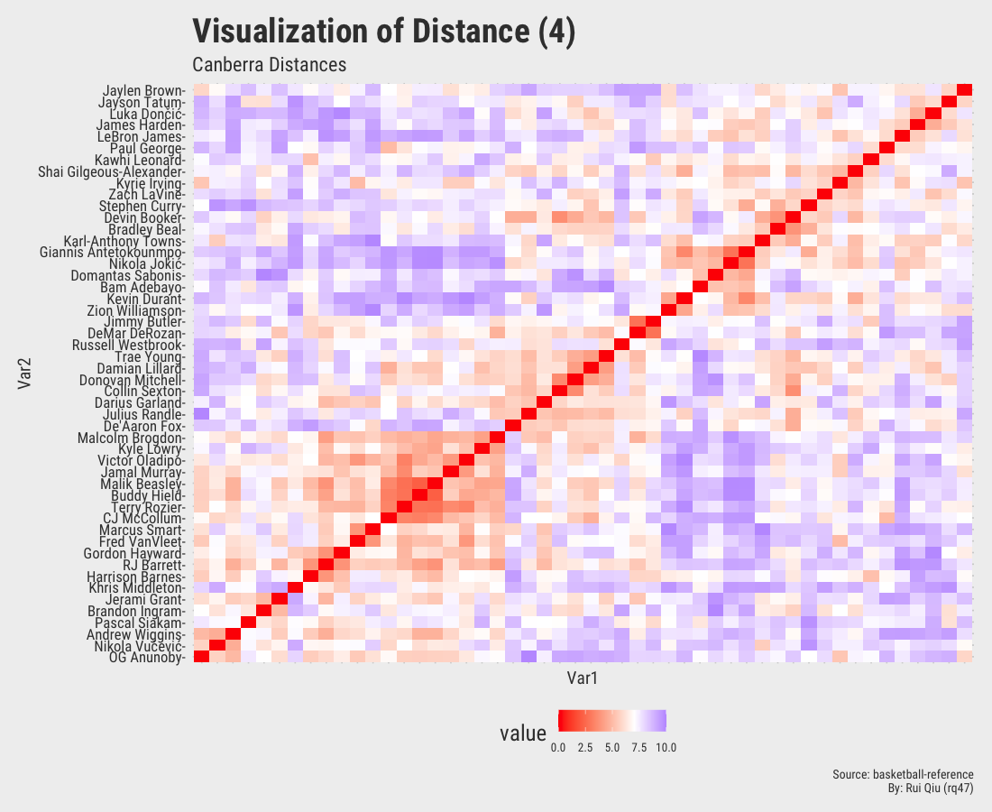
This section focuses more on the similarity/dissimilarity of numeric vectors. A total of four different metrics are used to calculate the distances between two players. Note that the player names on x-axis are removed to keep the visualization result tidy. They are essentially the same as y-axis.
Open in new tab to see in full size.
Open in new tab to see in full size.
$\text{cosine similarity} = \frac{\mathbf{x}\cdot \mathbf{y}}{\sqrt{\mathbf{x}\cdot\mathbf{x}}\sqrt{\mathbf{y}\cdot\mathbf{y}}}$
The
dist() function in R does not have Cosine Similarity as a distance metric. It is not hard
to implement with R though.
Open in new tab to see in full size.
Open in new tab to see in full size.
Even though the player names are mixed up in each of the heatmaps, three out of four, except the one generated by Canberra distance, roughly show the evidence of three clustered groups in the sense of similarity.
1.5 Selecting the optimal $\ k$ value
In previous sections of this part, different $\ k$ values are visually evaluated but never rigorously determined.
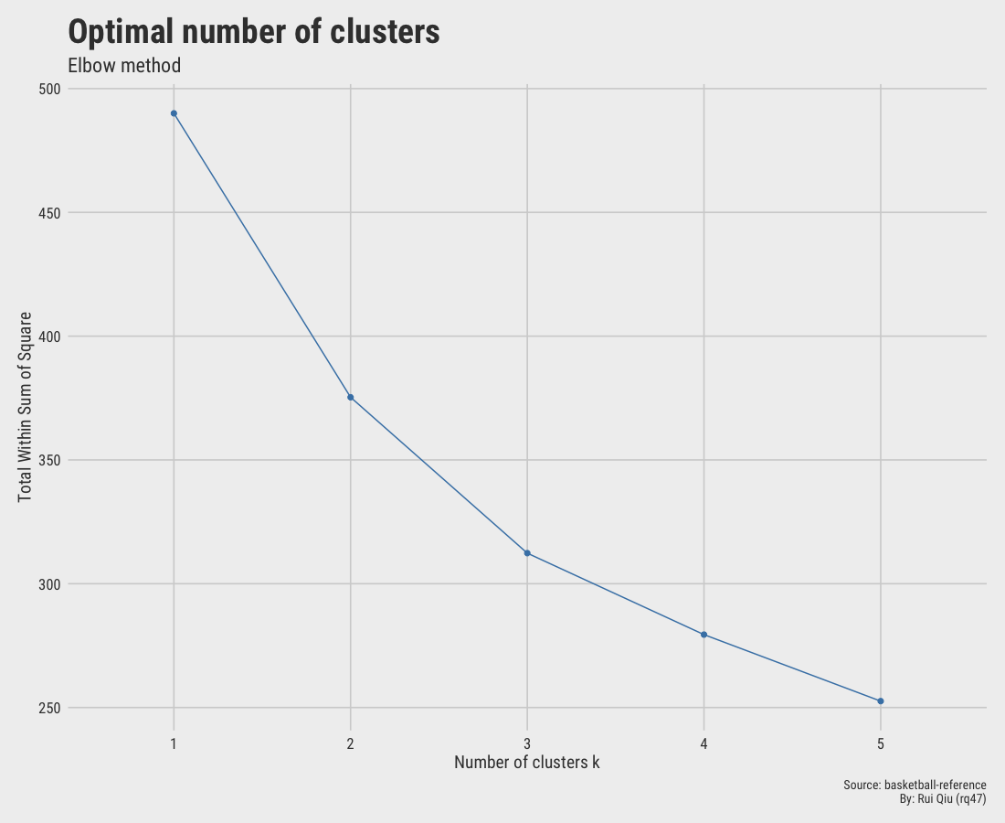
1.5.1 Elbow method
Open in new tab to see in full size.
The elbow method suggests $\ k=2$ is the optimal value since the drop from 1 to 2 is the greatest, thus making $\ k=2$ an "elbow."
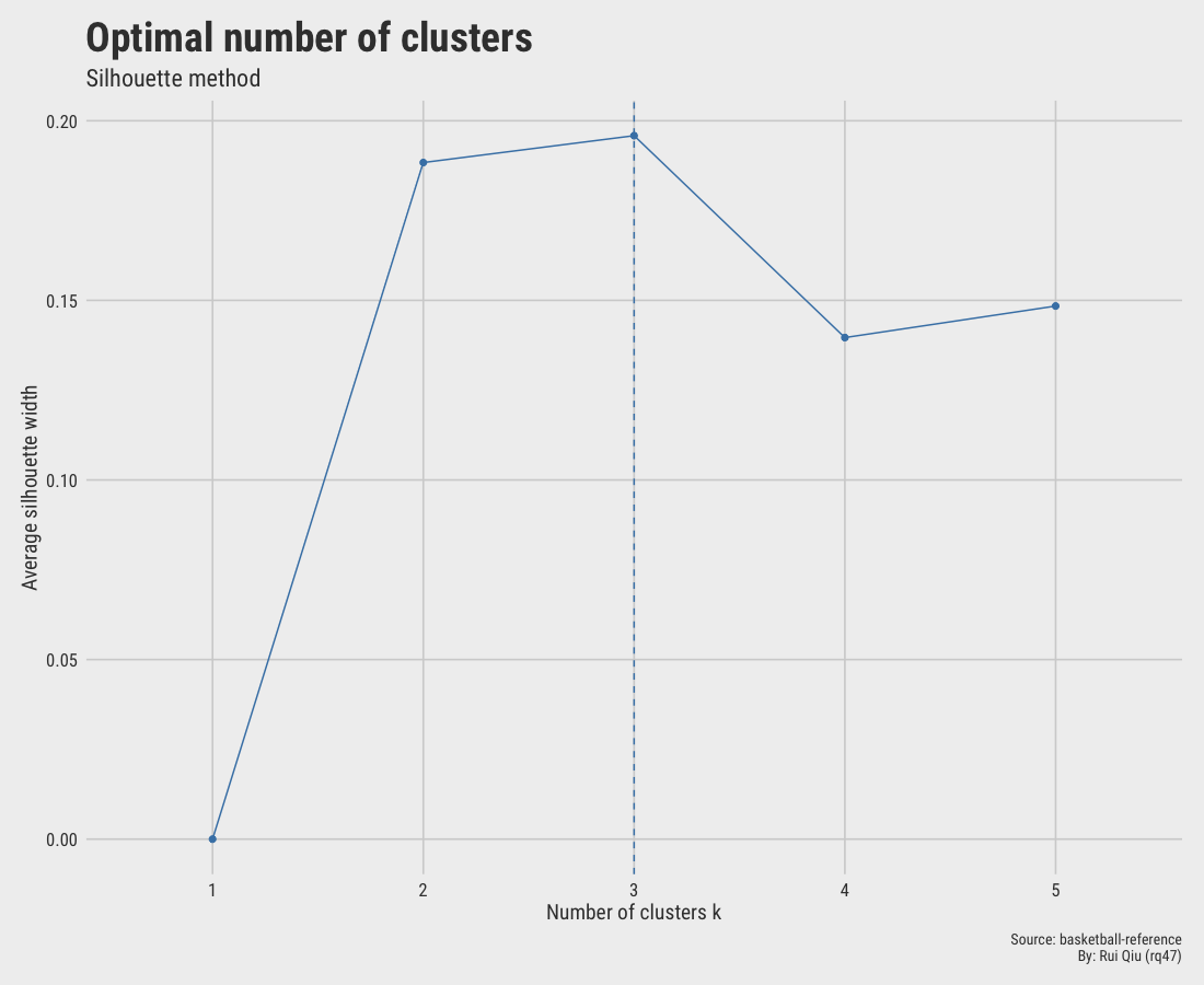
1.5.2 Silhouette score
Open in new tab to see in full size.
The Silhouette score at $\ k=3$ is maximized, suggesting $\ k=3$ to be optimal. However, $\ k=2$ is very close in the score as well. Hence, the selection here is not decisive.
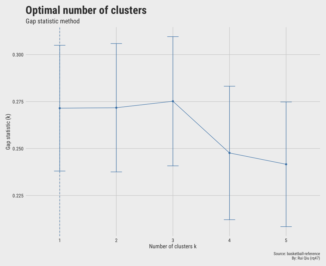
1.5.3 Gap statistic
Open in new tab to see in full size.
The gap statistic is slightly off since it hints at an optimal value of $\ k=1$
This one basically makes no sense.
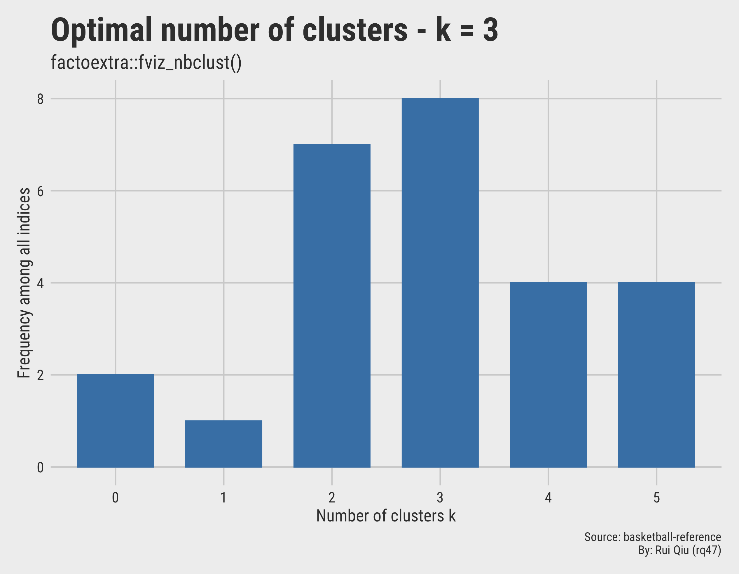
1.5.4 Use fviz_nbclust() to automate
Another approach to automate the selection procedure is to utilize
fviz_hbclust() function from {factoextra}. The
function
determines and visualizes the optimal number of clusters using different methods,
within-cluster sum of squares (elbow), average silhouette and
gap statistics. The most convenient part is its text output,
telling
you the optimal $\ k$ in plain text.
*** : The Hubert index is a graphical method of
    determining the number of clusters. In the plot
    of Hubert index, we seek a significant knee
    that corresponds to a significant increase of
    the value of the measure i.e the significant
    peak in Hubert index second differences plot.

*** : The D index is a graphical method of determining
    the number of clusters. In the plot of D index, we
    seek a significant knee (the significant peak in
    Dindex second differences plot) that corresponds
    to a significant increase of the value of the
    measure.

*****************************************************
* Among all indices:
* 7 proposed 2 as the best number of clusters
* 8 proposed 3 as the best number of clusters
* 4 proposed 4 as the best number of clusters
* 4 proposed 5 as the best number of clusters

                ***** Conclusion *****

* According to the majority rule, the best number of
  clusters is  3


*****************************************************
Among all indices:
===================
* 2 proposed  0 as the best number of clusters
* 1 proposed  1 as the best number of clusters
* 7 proposed  2 as the best number of clusters
* 8 proposed  3 as the best number of clusters
* 4 proposed  4 as the best number of clusters
* 4 proposed  5 as the best number of clusters

Conclusion
=========================
* According to the majority rule, the best number of
  clusters is  3 .
Again, this method agrees on $\ k=3$. The voting results can be also visualized:
Open in new tab to see in full size.
1.6 Cluster prediction
Please see the other tab "Cluster Prediction" for more details.
1.7 Summary
The previous clustering suggests either $\ k=3$ or $\ k=2$ are the most suitable number of clusters hidden within the data. However, the original label is the position of a player, which contains five possible values: PG, SG, SF, PF, and C. Despite that, the clustering with $\ k=5$ is horrible, with lots of overlapping areas. This means the clustering method does not learn quite well to describe a player’s playing position by his on-paper statistics.
Nevertheless, here are takeaways from this experiment:
- The clustering method selected does affect the clustering results.
- For hierarchical clustering, parameter tuning does affect the clustering results.
- Even though the clustering does not learn the position of players, it successfully partitions players into 2 or 3 diversified groups. To some extent, it polarizes players to two extremes, either offensive or defensive.
- Maybe replacing basic statistics with advanced statistics might be more descriptive when it comes to generating a player’s profile.
- The evolution of modern basketball is at someplace where there are no fixed positions compared to what prevailed 20 or 30 years ago. Versatile players are more welcomed nowadays, such as a center who can run the offense as a post playmaker or a guard who can hustle all the time, grabbing rebounds. Even the word "3D" stands for 3-pointers and defense. No roles on the court are specialized for a single task. Players like Ben Simmons can easily guard against 1 to 5, doing anything possible on the court (except shooting?)
- In this way, we can easily blame the poor performance of clustering for not enough tuning, or this is THE CASE. The positions on the court are just labels used to connect the old school basketball to modern games. They are like the jersey numbers to distinguish a player, nothing less, nothing more.
2. Clustering news (hopefully) to distinguish the categories
Due to the limit of the effective width of this web design, please bear that most visualizations down there are in better visual experience when clicked and enlarged.
2.1 Data cleaning
The original design is to distinguish sources that cover NBA news. But the test run is not very convincing as the clustering messes up everything. An assumption would be that word usage is pretty much identical for most of them. In the end, this is not identifying authors by their writing styles. Therefore, a further trial is conducted after the introduction of more diversified news sources.
The new inclusion includes:
A wordcloud of the terms excluding the stopwords is shown below.
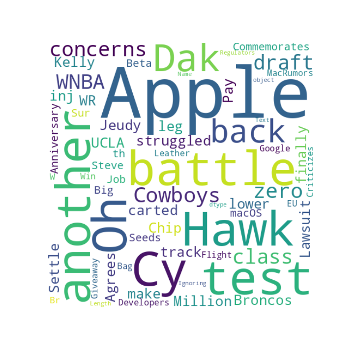
Open in new tab to see in full size.
2.2 K-means clustering with different $\ k$ values
The 400 news articles are concatenated into one data frame. Unlike last time, the title and
headline are
combined into one string variable. The text will later be vectorized by two different vectorizers,
CountVectorizer and TfidfVectorizer,
respectively.
| Source | Date | Text | |
|---|---|---|---|
| 0 | ESPN | 2021-09-09 | The battle for the Cy Hawk another test for Oh... |
| 1 | ESPN | 2021-09-09 | Dak is back Why the Cowboys have zero concerns... |
| 2 | ESPN | 2021-09-09 | Why the WNBA draft class has struggled to make... |
| 3 | ESPN | 2021-09-09 | Is UCLA finally on track with Chip Kelly After... |
| 4 | ESPN | 2021-09-12 | Broncos WR Jeudy carted off with lower leg inj... |
| ... | ... | ... | ... |
| 395 | MacRumors | 2021-10-05 | Apple Agrees to Pay Million to Settle Lawsuit ... |
| 396 | MacRumors | 2021-10-05 | Apple Commemorates th Anniversary of Steve Job... |
| 397 | MacRumors | 2021-09-30 | Apple Seeds macOS Big Sur Beta to Developers W... |
| 398 | MacRumors | 2021-10-01 | MacRumors Giveaway Win a Flight Bag Leather Br... |
| 399 | MacRumors | 2021-09-27 | Google Criticizes EU Regulators for Ignoring A... |
- clustering-news-cv.csv: DTM by CountVectorizer.
- clustering-news-tfidf.csv: DFM by TfidfVectorizer.
The screenshots of these two data frames above are shown below.
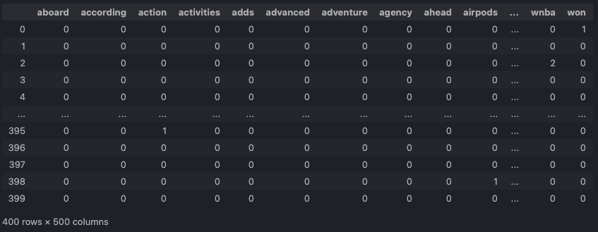
CountVectorizer.Open in new tab to see in full size.
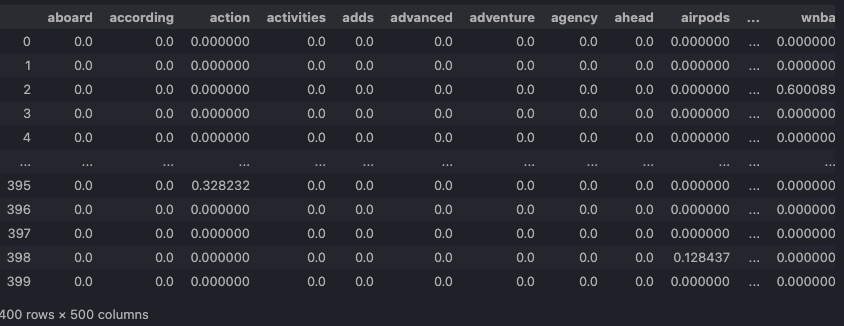
TfidfVectorizer.Open in new tab to see in full size.
A re-usable function iterate_w_k() is implemented to perform dimension
reduction, K-means clustering over the reduced features, and output the visualization along with two
metrics
(the homogeneity and Silhouette score.)
The clusterings with CountVectorizer preprocessed data and k from 2 to
5:
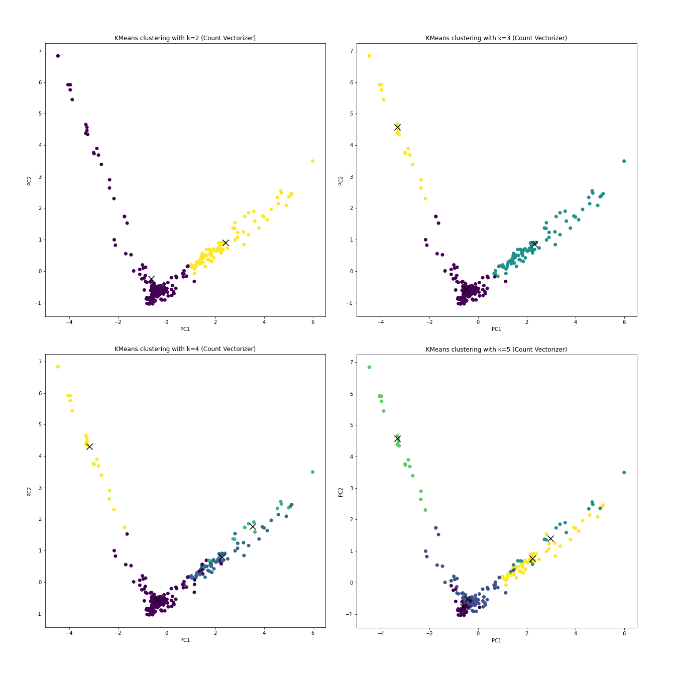
CountVectorizer.Open in new tab to see in full size.
The clusterings with TfidfVectorizer preprocessed data and k from 2 to
5:
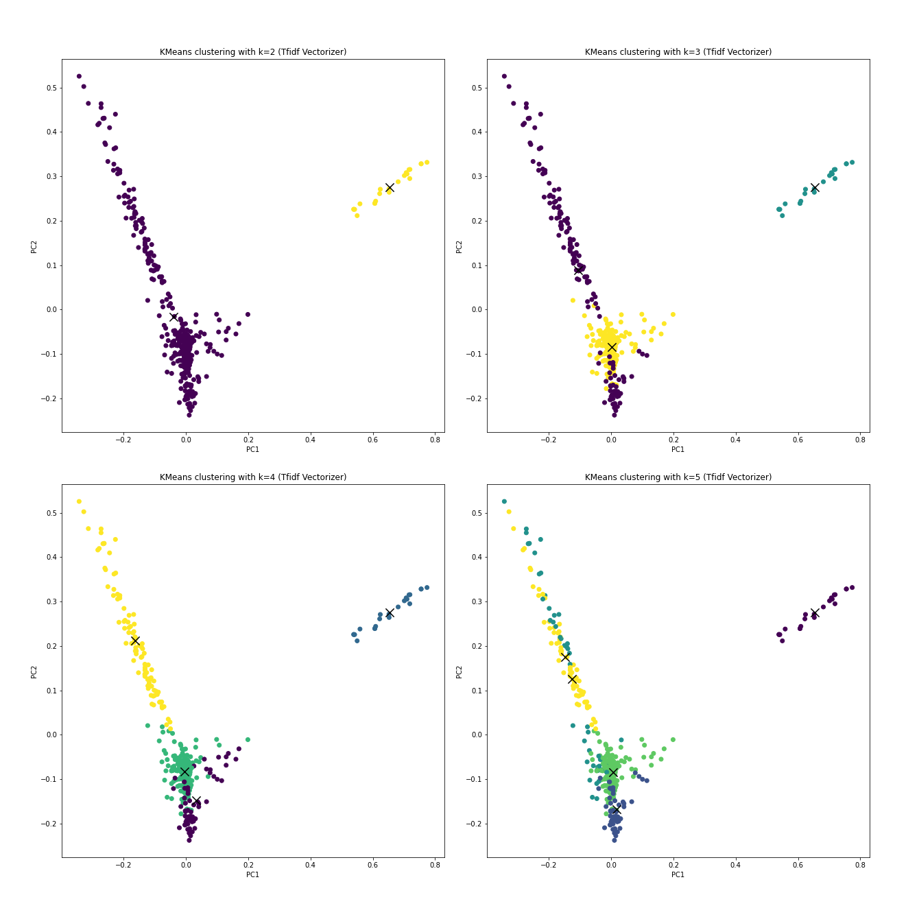
TfidfVectorizer.Open in new tab to see in full size.
With the prior knowledge that if the clustering truly learns anything about resources, k should be 4 without any debate.
The following table lists the homogeneity score, which tells how alike the data are with a cluster, and the Silhouette score, which describes how far the clusters are from each other. Ideally, the higher, the better for both.
k=2 |
k=3 |
|
|---|---|---|
homogeneity score (CountVectorizer) |
0.2914526756355663 | 0.36946391298809556 |
Silhouette score (CountVectorizer) |
0.16836203241503322 | 0.17904908336242356 |
homogeneity score (TfidfVectorizer) |
0.06146851457954772 | 0.39324808032485964 |
Silhouette score (TfidfVectorizer) |
0.029815094893238428 | 0.034968169736253746 |
k=4 |
k=5 |
|
|---|---|---|
homogeneity score (CountVectorizer) |
0.29680912347283095 | 0.45727954760694456 |
Silhouette score (CountVectorizer) |
0.17863738778270835 | 0.08412074984413664 |
homogeneity score (TfidfVectorizer) |
0.5800599275998554 | 0.5257363389005074 |
Silhouette score (TfidfVectorizer) |
0.04392759797869041 | 0.04084535197279959 |
Roughly speaking, k=4 with TfidfVectorizer gives a decent clustering
result.
For the procedures below, k=4 will be selected as an example.
2.3 DBSCAN
The Density-Based Spatial Clustering of Applications with Noise detects the samples of high density and expands clusters from them. Since the Silhouette scores above are relatively low, DBSCAN is an alternative to be considered. With k=4, the DBSCAN clusters are:
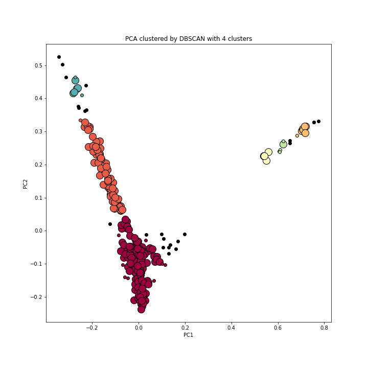
Open in new tab to see in full size.
However, hyper-parameter tuning in DBSCAN is really tricky. The following two articles provide very detailed solutions to tuning.
- A Step by Step approach to Solve DBSCAN Algorithms by tuning its hyper parameters
- How to Use DBSCAN Effectively
It will take pages to dissect the problem, which is not the focus of this part of the portfolio.
2.4 Hierarchical clustering
The hierarchical clustering, unlike anything above, suggests that k=3 should also be considered.
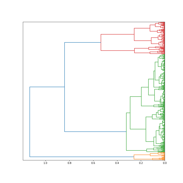
Open in new tab to see in full size.
2.5 Optimal $\ k$
So back to the Silhouette scores. A thorough but tedious Silhouette analysis is conducted on k from value 2 to 5.
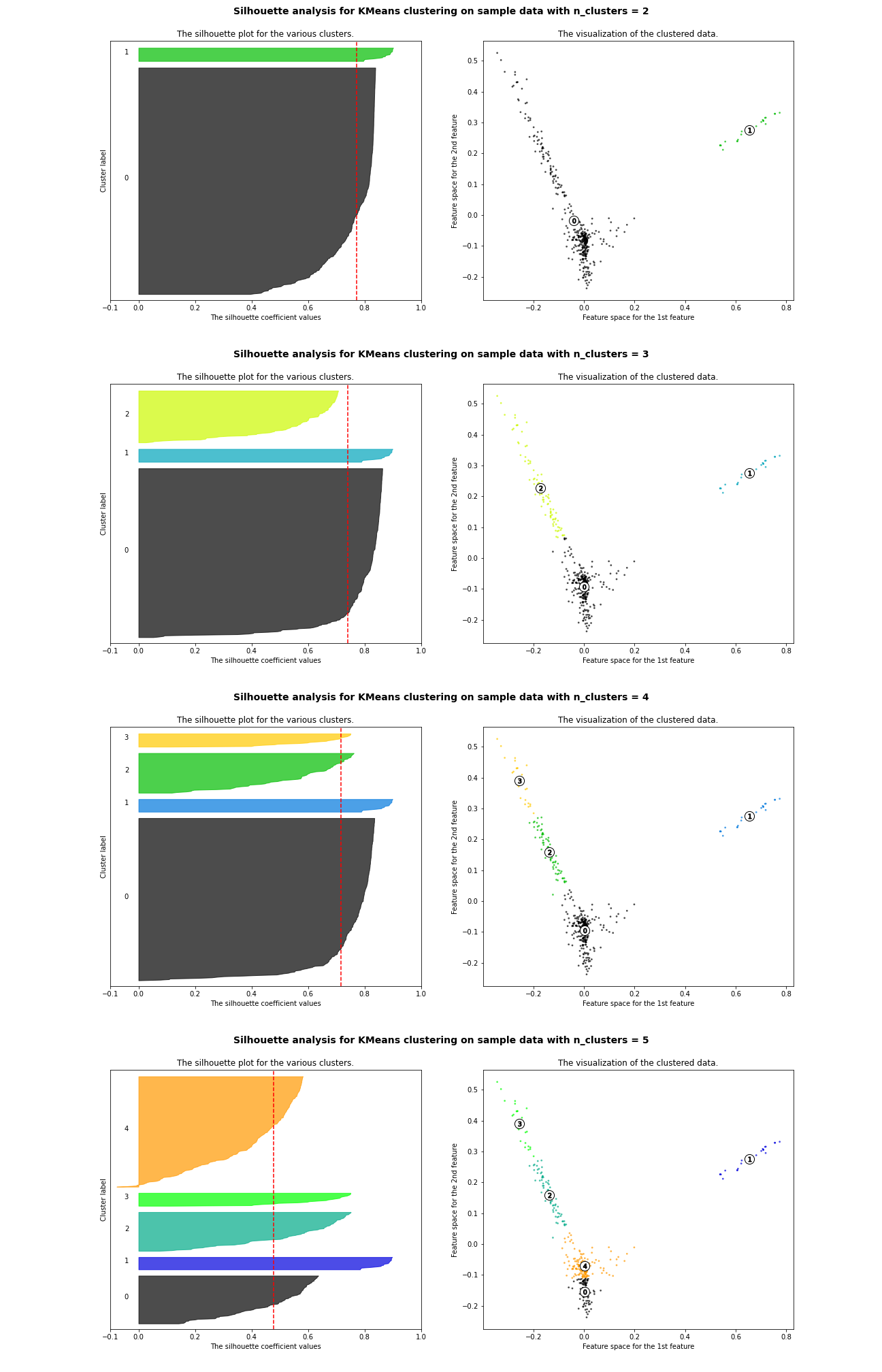
Open in new tab to see in full size.
The thickness of each color strip indicates the size of a cluster under its k value. k=3 is a lousy pick since there are some clusters with below-average Silhouette scores. k=5 is another poor choice due to the fluctuation in the size of the silhouette plots.
For n_clusters = 2
The average silhouette_score is : 0.7721933252661253
For n_clusters = 3
The average silhouette_score is : 0.741629848098952
For n_clusters = 4
The average silhouette_score is : 0.7170194571369254
For n_clusters = 5
The average silhouette_score is : 0.47913326363536746
Although k=2 delivers a higher average Silhouette score, its lead against k=4 is not significant. In addition, the cluster sizes of k=2 are more extreme than those of k=4.
With prior knowledge generally known to everyone, k=4 is a more logical choice.
2.6 Summary
tf-idf and counts give different results. This is totally reasonable since two of them have unique emphasis. Count is just the plain frequency of certain words' appearances in a document, while tf-idf, according to Wikipedia, "increases proportionally to the number of times a word appears in the document and is offset by the number of documents in the corpus that contain the word, which helps to adjust for the fact that some words appear more frequently in general."
When TfidfVectorizer is selected as the text processing vectorizer, a
series of
trials to find the optimal k value begins. Although some of the results don't coincide, they
still manage to
give some insights about the text data from their own perspectives.
A potential explanation for poor performance in text clustering could be: the sample size is limited, and the text material within each news piece is not long enough at the same time. A more appropriate approach to study text data will be introduced in next section.
3. Topic modeling with news
This is a bonus part that might be interesting under the same topic. Frankly, text clustering is something fundamental to do in natural language processing. But the story never ends there.
A topic is defined by a set of keywords, which are so important that each of them have a probability of occurrence for the topic. Naturally, different topics have their own keyword sets with corresponding probabilities, while sharing some common keywords at the same time. And, looking at the this in a larger picture, a document in the corpus can contain several topics.
On the contrary, the clustering algorithm clusters documents into different groups based on a selected similarity metric.
For the use case in this chapter of the portfolio, topic modeling seems to be a preferable choice, especially the prior knowledge we have about the documents are their sources, which basically are equivalent to news topics they report and cover.
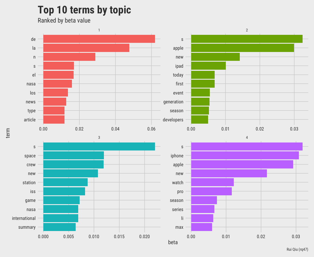
A Latent Dirichlet allocation (LDA) is used to perform a topic modeling on the same news data.
R script for topic modeling: topic-modeling.R
A quick and dirty LDA gives the following 4 topics ranked by beta value, which is the per-topic-per-word probability.
The tf-idf data frame containing all the information of 400 text segements is:
# A tibble: 10,172 × 7 document term count tf idf tf_idf source1 text303 cinderella 7 0.259 5.99 1.55 Polygon 2 text325 castlevania 5 0.179 5.99 1.07 Polygon 3 text89 reid 2 0.154 5.99 0.922 ESPN 4 text308 battlefield 3 0.15 5.99 0.899 Polygon 5 text21 ap 2 0.154 5.30 0.815 ESPN 6 text106 storage 5 0.147 5.30 0.779 MacRumors 7 text50 nhl 3 0.158 4.89 0.773 ESPN 8 text27 trolls 2 0.125 5.99 0.749 ESPN 9 text27 bunch 2 0.125 5.99 0.749 ESPN 10 text47 redick 2 0.125 5.99 0.749 ESPN # … with 10,162 more rows
The per-topic-per-word (gamma) probability for all topic-document combination is:
# A tibble: 1,600 × 3 document topic gamma1 text1 1 0.000808 2 text2 1 0.00136 3 text3 1 0.996 4 text4 1 0.00143 5 text5 1 0.00123 6 text6 1 0.000891 7 text7 1 0.000834 8 text8 1 0.000957 9 text9 1 0.469 10 text10 1 0.00117 # … with 1,590 more rows
The visualization of top words by topic is listed below.
Open in new tab to see in full size.
It's not a secret that this LDA topic modeling has its own problem as well: although the stopwords are removed in the preparation of dfm, there are still lots of meaningless terms in the final output.
References
-
Stackoverflow - How do I predict new data’s cluster after clustering training data?
-
scikit-learn: Selecting the number of clusters with silhouette analysis on KMeans clustering
-
StackExchange: What is the difference between topic modeling and clustering?
-
A Step by Step approach to Solve DBSCAN Algorithms by tuning its hyper parameters